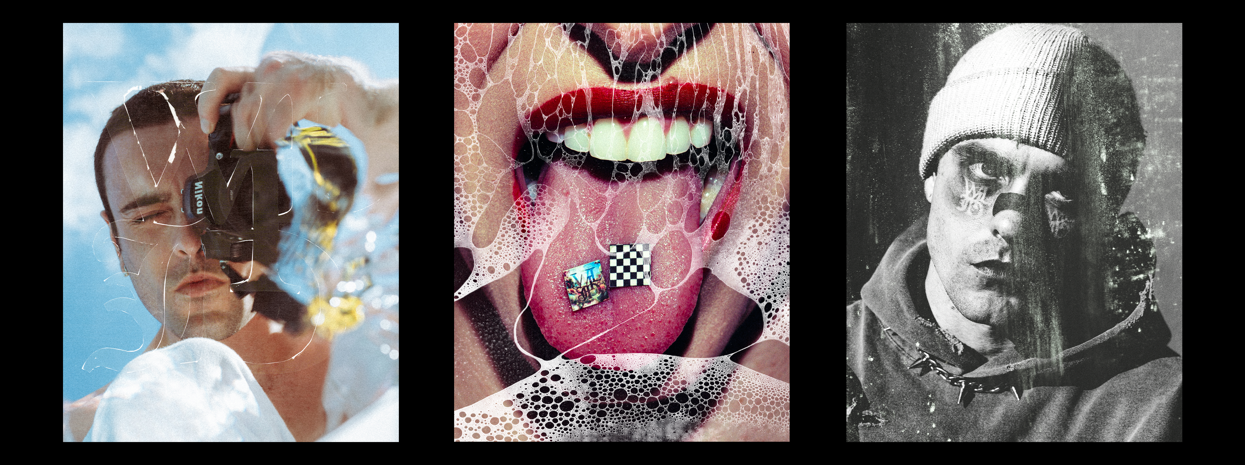
Look, we all love a good texture overlay. Dust, grain, grit, paper tears, light leaks.. they can take a photo from “nice” to “holy shit balls, that’s art.” But there’s a fine line between tastefully stylized and looking like you edited your photo in Picnik at 2am on a dial up connection. I’ve been there.. Low moment.
So here’s how to add texture and overlays without turning your work into a chaotic mess straight outta a 2008 emo fan page.
1. Start With a Solid Base Edit
Before you throw anything on top of your photo, make sure the base is clean. Good lighting, balanced contrast, and decent color grading go a long way. Textures are the seasoning, not the main dish.
If the photo doesn’t slap before the overlay, it won’t slap after either.
2. Pick Textures That Match the Mood
Don’t just chuck a random film burn on a moody portrait because you saw someone else do it. Ask yourself:
• What’s the emotion?
• Is this gritty? Dreamy? Messy? Clean?
• Do I want to enhance realism or create something surreal?
A cracked glass texture on a soft, romantic portrait? Probably not the vibe. A soft paper fold on a vintage toned image? Hell ye.
3. Use the Right Blend Mode (and Don’t Overdo Opacity)
In Photoshop or any editing app with layers:
• Try Screen, Overlay, or Soft Light blend modes.
• Keep the opacity between 15 to 40% to avoid looking like a collage assignment from Year 9 art class. Self deprecating a lot here.. My bad
And for the love of aesthetics.. erase where needed. Don’t let textures cover eyes, key details, or important focal points unless it’s intentional.
4. Layer With Intention, Not Chaos
One texture can be enough. Two if they complement each other.
Ten? Nah fam.
You’re not scrapbooking, you’re storytelling.
If you layer, try:
• One texture for overall vibe (grain or paper)
• One for focus/highlight (light leak, glass, scratch)
5. Match Resolution or Prepare for Pixel Hell
Slapping a low res texture on a high res photo = instant downgrade big L.
Make sure your textures are high res.. especially if you’re printing or posting big.
All my texture packs are made for large-scale use, so you won’t end up with crusty JPEG pixels ruining your shot. Just saying.
6. Don’t Use the Same Texture on Every Photo
That’s how you end up with a feed that looks like a Tumblr graveyard.
Switch it up. Let each image speak for itself. Have a few go to textures you love, but don’t become predictable. Art evolves.. so should your editing.
7. Use Texture to Add Emotion, Not Just Aesthetic
Grain can feel nostalgic. Paper can feel vintage. Light leaks can feel dreamlike.
It’s not just about how it looks.. it’s about what it feels like.
Overlay work should enhance the emotion, not distract from it.
Final Thoughts
Texture and overlays are powerful tools.. when used with intention. You’re not trying to make your work look like MySpace era profile pics (unless that is the vibe, in which case… own it, legend). You’re trying to add mood, character, and story.
So next time you’re dragging that grainy JPEG over your portrait, ask yourself:
Does this make it better… or just busier?
Stylize smart, keep it sharp, and let the emotion lead.


Share:
How I Shoot Self Portraits That Don’t Feel Cringe